All parts of the city have experienced staggering rates of
appreciation since 2011, but some neighborhoods stand out
(for a variety of different reasons)
2000 to present, different city districts experienced bubbles,
crashes and recoveries of vastly varying magnitudes
May 2018 Report
————————————————————
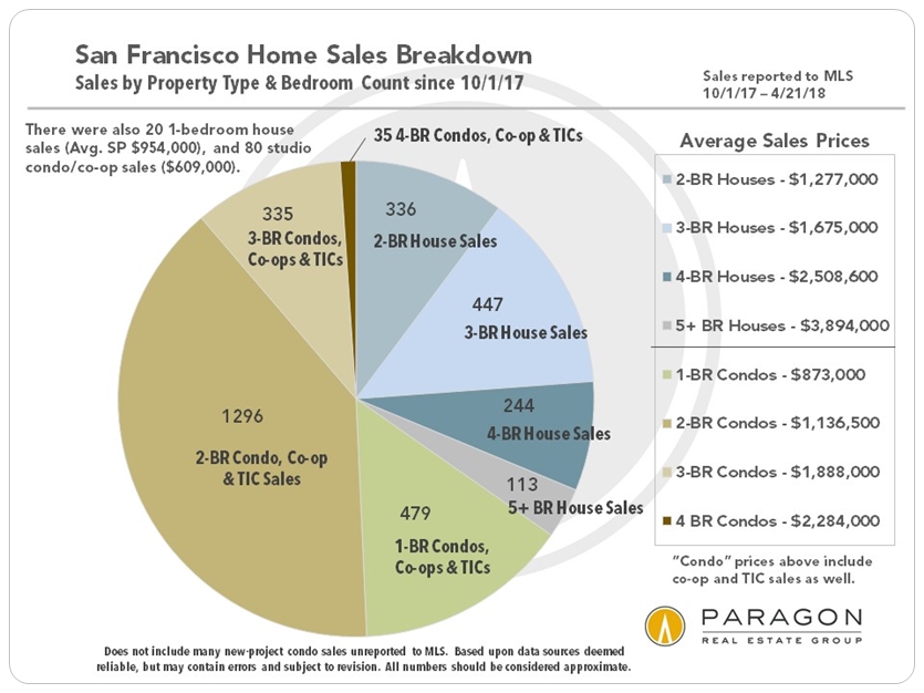
Before discussing neighborhood values, appreciation rates and market cycles, here are 3 overview charts on the entire city market.
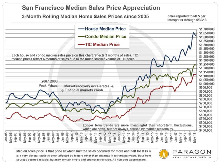
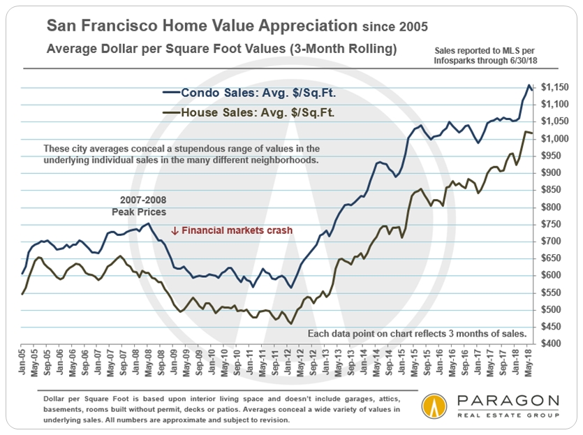
Citywide Home Values & Trends
On a 3-month-rolling basis, median home sales prices in San Francisco yet again hit new highs in April 2018: The median house sales price jumped $55,000 over the March price to hit $1,665,000, and the median condo sales price jumped $50,000 in April to $1,225,000 (3-month rolling sales through 4/30/18, reported by May 2). Those reflect year-over-year increases of 23% and 8% respectively. Average dollar per square foot values also reached new peak values.
————————————————————
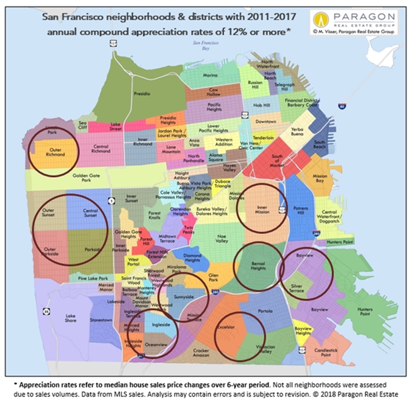
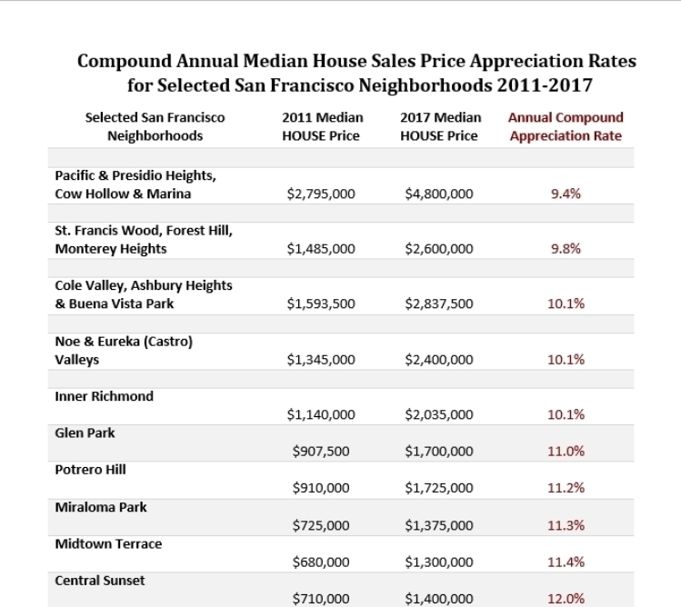
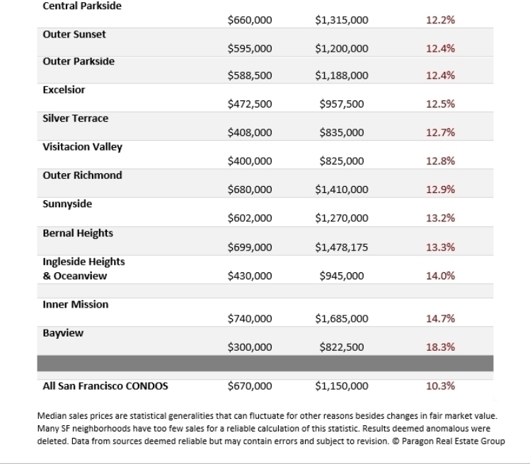
Highest Median House Price Appreciation Rates by Neighborhood:
Compound Annual Appreciation Percentages, 2011 – 2017
The neighborhoods and districts circled on the map below have seen compound annual appreciation rates of 12% or more over the past 6 years. As a point of comparison, the national rate over that period was about 7%, and the CPI inflation rate about 1.5%. As illustrated in the table below the map, the highest rate in San Francisco over the period was above 18%.
If the return on cash investment was calculated for purchasing with a 20% down payment (instead of paying all cash), and adjusting for closing costs (estimated at 2% on buy-side, 7% on sell side), the compound annual rate of return on the cash investment soars: A 10% annual rate of home price appreciation would then translate into an annual compound return on cash investment of just under 40%. The use of financing in homeownership is one of the reasons why it can often be such a good investment to develop household wealth over time.
Total 6-year appreciation rates can be calculated by dividing the 2017
median house sales price by the 2011 price.
Though median home price appreciation rates throughout the city have been incredibly high by any reasonable measure, some neighborhoods have outpaced the norm. The main reason is affordability: Less expensive homes have appreciated considerably faster than more expensive homes. Also, some of the most affordable districts were hammered by foreclosure sales after the 2008 crash, which brought their sales prices down to unnatural lows by 2011 – setting the stage for dramatic recoveries. Bayview, with the most affordable houses in SF and also worst hit by the 2008-2011 distressed property crisis, has had the highest compound annual appreciation rate since that time, a staggering 18.3%, or a 6-year total rate of 174%. Other affordable neighborhoods running across the southern border of the city – such as Excelsior, Visitacion Valley, Sunnyside, Ingleside and Oceanview – also saw extremely high annual rates of 12% to 14% for similar reasons.
The dynamic in the Inner Mission was somewhat different: Its 14.7% compound annual rate of appreciation – a total of 128% over the 6 years – was because it turned into the hottest, hippest district in the city, especially among younger high-tech workers. The gentrification which had been slowly occurring for 30 years suddenly went into overdrive to catapult prices higher.
Bernal Heights – with a 13.3% compound annual rate and 111% 6-year total – is right next to the Mission on one side and to Noe Valley on another. It was perfectly situated to take advantage of the classic overflow effect for people who wanted a similar neighborhood ambiance to Noe or Eureka Valley, but could no longer afford their much higher prices. Outer Richmond was also a standout: It has the lowest house prices in the northern third of the city. And the Sunset & Parkside district is filled with mid-price 2 and 3 bedroom houses, has a variety of attractive neighborhood commercial districts, ocean or parks on 3 sides, and easy access to highways south to the peninsula. All these factors have made it into a much sought-after location to purchase a home in recent years. The market there is insanely hot now.
The most expensive neighborhoods in the city have lower, but still very high rates of appreciation. And in dollar terms, their appreciation returns are by far the highest in the city.
CONDOS: Calculating appreciation rates for SF neighborhood condo prices is an iffier process, because so many large, new condo projects have come on market, significantly impacting inventory and sales prices, and making it much more difficult to perform apples to apples comparisons. Therefore, our calculations, above and below, are performed for the entire city instead of for separate districts. It is certainly true that, due to supply and demand issues, condos have typically appreciated at somewhat lesser rates than houses, which have become the scarce commodity in SF. There has been some variation in condo appreciation rates depending on location, supply and price segment.
————————————————————
Up, Down, Up: A Longer-Term Look
at SF Home Value Changes since 2000
Bubble, Crash & Recovery
by District & Price Segment
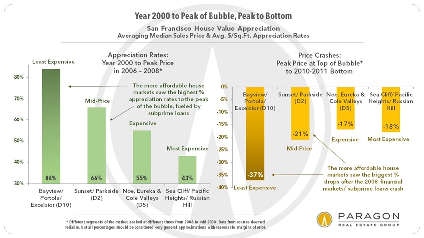
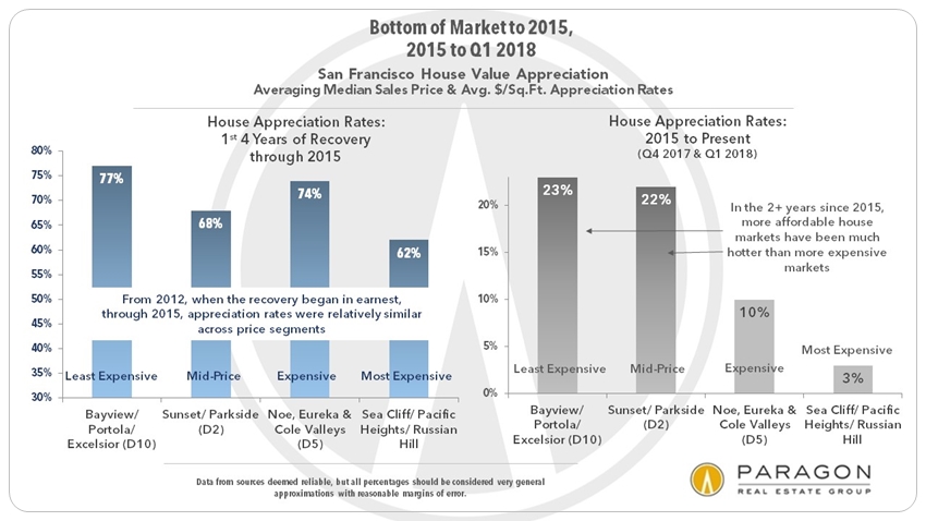
Home value appreciation in the charts below is broken down by 4 distinct time periods: 1) 2000 to peak of bubble (2006-2008, depending on price segment); 2) peak of bubble to bottom of market (typically 2011); 3) the 1st 4 years of the recovery, 2012 to 2015; and 4) 2015 to present.
House appreciation is broken down into 4 broad price segments as exemplified by the markets in 4 city regions: The least expensive segment is represented by house sales in the broad swathe of southern neighborhoods running from Bayview through Portola, Excelsior, Crocker Amazon and Outer Mission (Realtor district 10). The mid-price segment is illustrated by sales in the Sunset & Parkside district (Realtor district 2). The central Noe, Eureka & Cole Valleys district (district 5) is used to represent the expensive segment; and the very expensive house segment is illustrated by the northern, old-prestige neighborhoods running from Sea Cliff, Lake Street & Jordan Park through Pacific & Presidio Heights, Cow Hollow and Marina to Russian, Nob & Telegraph Hills (which are the very affluent parts of 3 different Realtor districts).
These areas were used because of their quantity of sales and the relative homogeneity of values within them. For condos, appreciation rates were calculated on the entire SF condo market. The calculations below were made by averaging both median sales price and average dollar per square foot appreciation rates. Present values are based on sales occurring in Q4 2017 and Q1 2018.
2000 to Peak of Bubble,
Crash to Bottom of Market
Less expensive homes saw by far the biggest bubbles (2000 to 2006-2008) and crashes (2008-2011), mostly due to the predatory lending/ subprime financing crisis. This was a phenomenon across Bay Area markets. (Note that different price segments peaked in different years from 2006 to mid-2008.)
Bottom of Market to 2015,
2015 to Present
The first 4 years of the recovery which began in 2012 saw high home-price appreciation rates across the city. In 2015, the market shifted – there was considerable financial market volatility in late 2015 and the first half of 2016, a precipitous drop in IPO activity, and the high-tech boom cooled temporarily – and appreciation rates diverged, with less expensive homes significantly outpacing more expensive neighborhoods. One factor was that buyers were desperately searching for homes they could still afford.
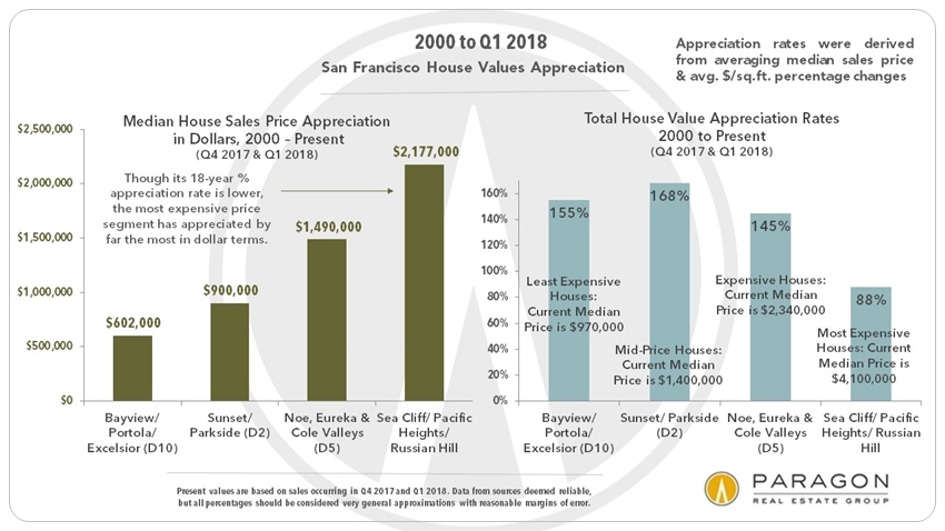
Overall Dollar & Percentage Appreciation
2000 to Present
By total percentage appreciation since 2000, Sunset/Parkside ranks first. By actual dollar appreciation, the most expensive home prices increased the most, typically by well into seven figures.
San Francisco Condo Appreciation
2000 to Present, All Districts
Generally speaking, the SF condo market has not seen appreciation rates as high as for houses. Mostly, this has to do with increasing supply due to the boom in new condo construction, but it was also affected by factors in 2015-2016 already described above.
————————————————————
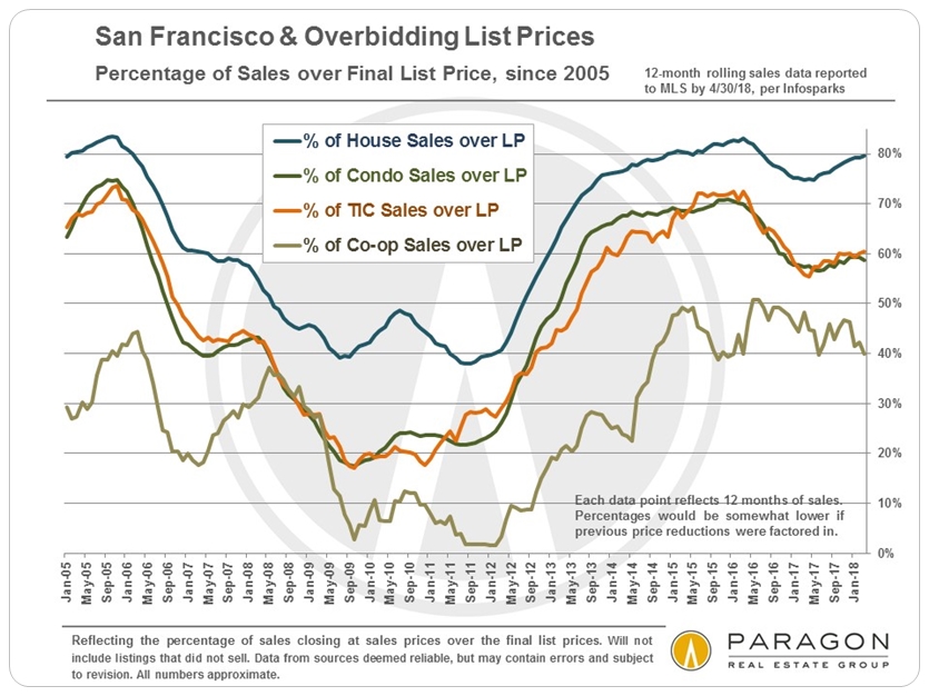
Percentage of Sales over List Price
by Property Type
This chart illustrates the difference in demand by property type.
Houses have been the hottest segment in recent years.
————————————————————
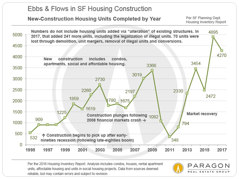
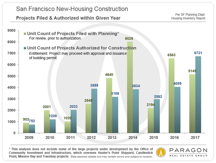
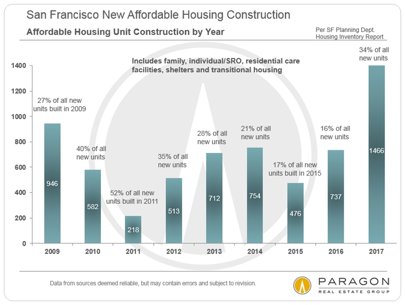
San Francisco New-Housing Trends
New construction, projects authorized, and affordable housing figures
based on SF Planning Department data recently released for 2017
————————————————————
Additional reading for those interested: Paragon Main Reports Page
Please let us know if you have questions or we can be of assistance in any other way. Information on neighborhoods not included in this report is readily available.
————————————————————
It is impossible to know how median and average value statistics apply to any particular home without a specific, tailored, comparative market analysis. In real estate, the devil is always in the details.
These analyses were made in good faith with data from sources deemed reliable, but may contain errors and are subject to revision. It is not our intent to convince you of a particular position, but to attempt to provide straightforward data and analysis, so you can make your own informed decisions. Median and average statistics are enormous generalities: There are hundreds of different markets in San Francisco and the Bay Area, each with its own unique dynamics. Median prices and average dollar per square foot values can be and often are affected by other factors besides changes in fair market value. Longer term trends are much more meaningful than short-term. Late-reported MLS activity may change certain statistics such as median sales prices, to some small degree.
© 2018 Paragon Real Estate Group